
Start with their level
Level and next-level progress come first. Individual quests and achievements sit alongside them.
01 / POCKETPULL
Building the experience around opening packs and collecting cards.
I’ve been with PocketPull from the start, owning product strategy, UX, and design direction. I also build frontend UI changes for desktop and mobile web.
PocketPull / Earn
01 / THE PRODUCT
Opening a pack is one part of PocketPull. I also had to make sense of the points, quests, rewards, and community features around it.
Collectors can earn points, complete quests, find cards in the market, and join guilds. My focus was on showing how those activities connect, so people can understand their progress and decide what to do next.
Start with the cards.
Quests, badges, and levels.
Points and shop benefits.
Shared goals through guilds.
02 / PROGRESSION
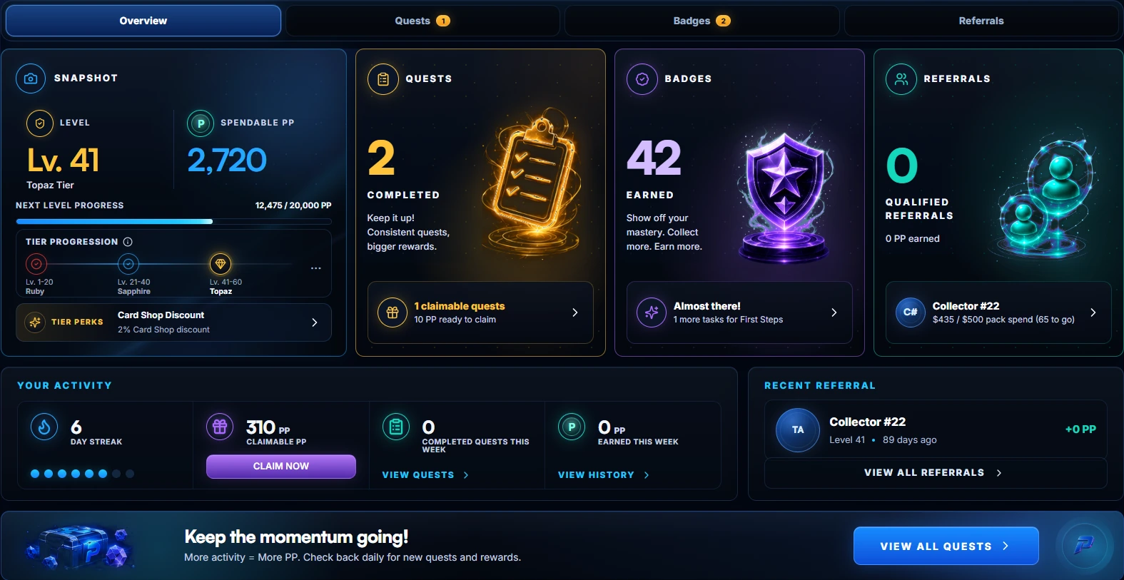
The Earn overview puts levels, points, quests, badges, and referrals together. I wanted a collector to see their progress without checking several separate pages.
Level and next-level progress come first. Individual quests and achievements sit alongside them.
“Spendable PP” tells collectors which points are available to use, rather than leaving them to infer that from their level.
Collectors can see a claimable reward or an unfinished goal and go straight to it.
03 / REWARDS
In the Card Shop, collectors can use points for an Origin Pack or a graded card. Prices, tier discounts, and any points shortfall sit beside the item.
On mobile, the card comes first, with its grade, points price, and shortfall below it. The bottom navigation stays available.
These screenshots show different account states: mobile is signed out; desktop includes a tier discount. That’s why the prices differ.
Worth keeping distinct: points, dollar prices, card values, and tier discounts. Each needs its own label so collectors know what they’re looking at.
04 / PACK OPENING
Once the card is revealed, the Pull Recap shows what that pull added to points, binder progress, quests, and badges.
The reveal stays focused on the card. Progress updates come afterward in a separate recap.
The recap brings the other updates together and includes a link to the relevant binder.
Recorded in the product. Wallet approval, account details, and audio have been removed.
05 / COMMUNITY
Guilds give collectors a way to work toward shared goals. Discovery shows each guild’s focus, membership, and activity before someone joins.
Collectors can filter by collection, sort the results, and compare membership and activity using the same fields on each card.
On mobile, those details stay together in a single-column card.
This screen says “Open roster” but shows 20/20 members. The copy needs to explain whether people can apply, join a waitlist, or wait for a space.
An open QA item in this version.06 / MOBILE WEB
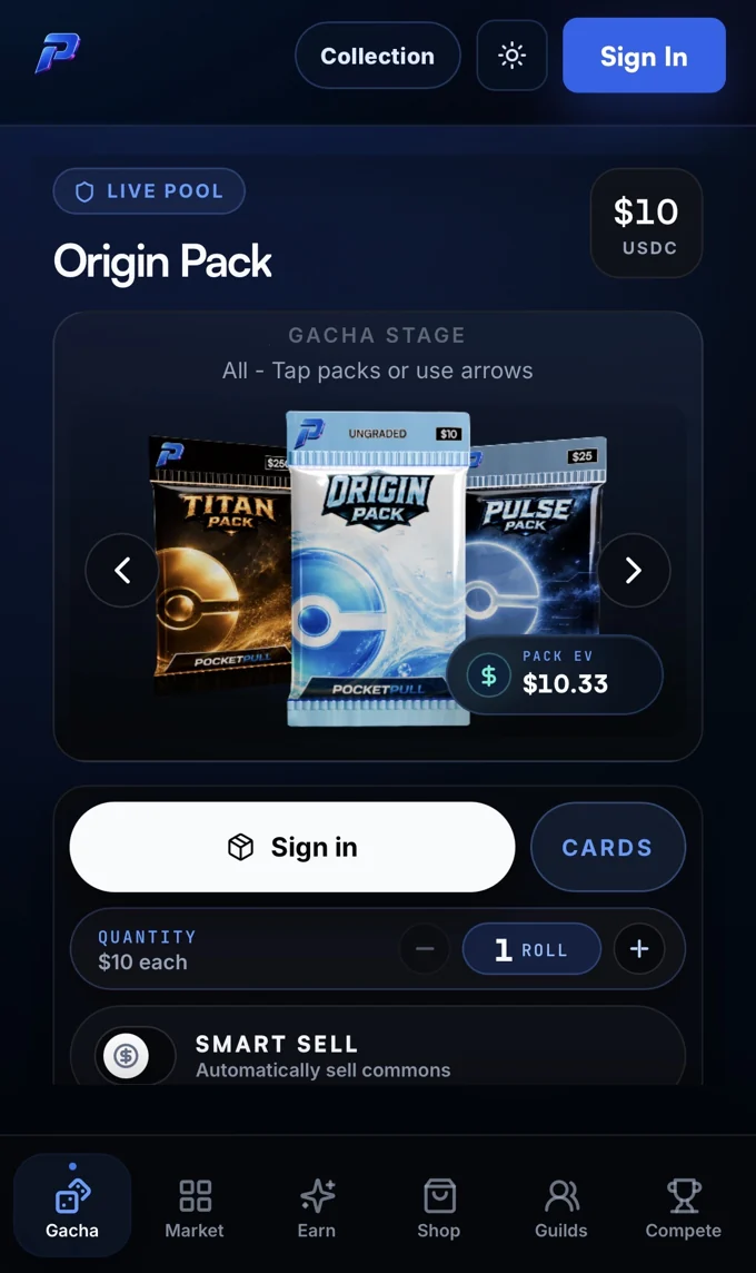
These screens show pack selection, quests, badges, and guilds on mobile web.
Mobile-web screenshots, including signed-out and zero-progress states.
07 / DEVELOPMENT
I used working prototypes to try out the experience, then made frontend UI changes and opened pull requests for engineering review.
Requirements, flows, product rules, states, and acceptance criteria.
AI-assisted concepts, critique, hierarchy, and interaction decisions.
Layouts, components, responsive behavior, and functional prototypes.
Code changes for review, implementation checks, and further iteration.
I worked in the codebase and brought changes to engineering for review. AI assisted with concepts and code. I chose the direction, reviewed the result, and worked through the UI changes.
These are screenshots and a recording of the implemented product. This version doesn’t yet include the earlier design iterations or a redacted pull request.
08 / RESULTS & NEXT STEPS
PocketPull recorded $600,000 in volume and 15,000 pack rips in its first month.
Beyond that first month, I’d look at how often collectors return, whether they understand their progress after a pull, and how they move from earning points to using them. I’d also keep reviewing the signed-out, empty, loading, and error states.
Repeat pack opening, return visits, and points redemption. First-month activity gives us a starting point; it doesn’t tell us how those habits develop.
KEEP EXPLORING